New York City Mayor's Office of Contract Services (MOCS)
- Website Design
- Content Strategy
- User Experience (UX)
- User Interface Design (UI)
- Information Architecture
- Government
- Professional Services
- Nonprofits
Overview
Evaluate, enhance and redesign external and internal websites for the NYC government agency responsible for procurement oversight. Both sites contained a plethora of resources and information that were not well organized making them difficult to find. We identified usability issues, built a more intuitive information architecture, developed a coherent visual language, and determined critical features to prioritize.
Goal and objective:
To improve the user experience so that vendors, non-profits, and procurement personnel can quickly and easily find the information they need.
Challenges:
• Large amount of disorganized assets and complex information
• Difficult to find information
• Duplication/redundancy: Information lives in multiple places
• Too many “text walls” (pages with too much text) in government speak, making it difficult for people to understand
• Navigation wording is obscure and not intuitive
Process
Research & discovery: conduct interviews & surveys to gather insights
• Conducted research including interviews with vendors, nonprofits and agency procurement personnel; reviewed MOCS service desk customer survey comments; and analyzed web usage data
• Created online survey questions to gain a deeper understanding of user challenges, goals and needs; uncovered pain points with the existing user journey; and determined measurement for successful user experience for completing tasks
• Based on a data-driven approach, key issues were identified and grouped under common themes, and usability obstacles and desired features were listed in order of priority
Target groups / Personas:
• To build empathy for different types of users, using quantitative and qualitative data from interviews and survey results, personas for four target group profiles were created to serve as a starting point to identify the needs and challenges of users and provide solutions to improve the user experience
• Personas were created for small business owners new to government contracting, staff from large companies familiar with procurement, nonprofit personnel, and government contracting officers providing vendor assistance
• Experience journeys were mapped out for each group to identify ways to achieve their goal as quickly and easily as possible
Information Architecture
Content Audit
Performed a content audit of the entire site, including all information and features, to provide insight into which content to keep, update, delete, and create. A review of MOCS’ resources portfolio helped determine the most helpful assets, opportunities to combine or streamline information, and resources that can be archived.
Sitemap
Based on the established personas and their needs, a sitemap was created to show the information architecture, define the taxonomy (information categories), and visualize how individual webpages and sections are related.
Ideation
With findings from research and content analysis, we brainstormed options to solve pain points, additions for pages and features that can improve the overall user experience. We made quick sketches, edits, additions, continuously improving a concept, tested it, tweaked it, and repeated the cycle to uncover the best solutions.
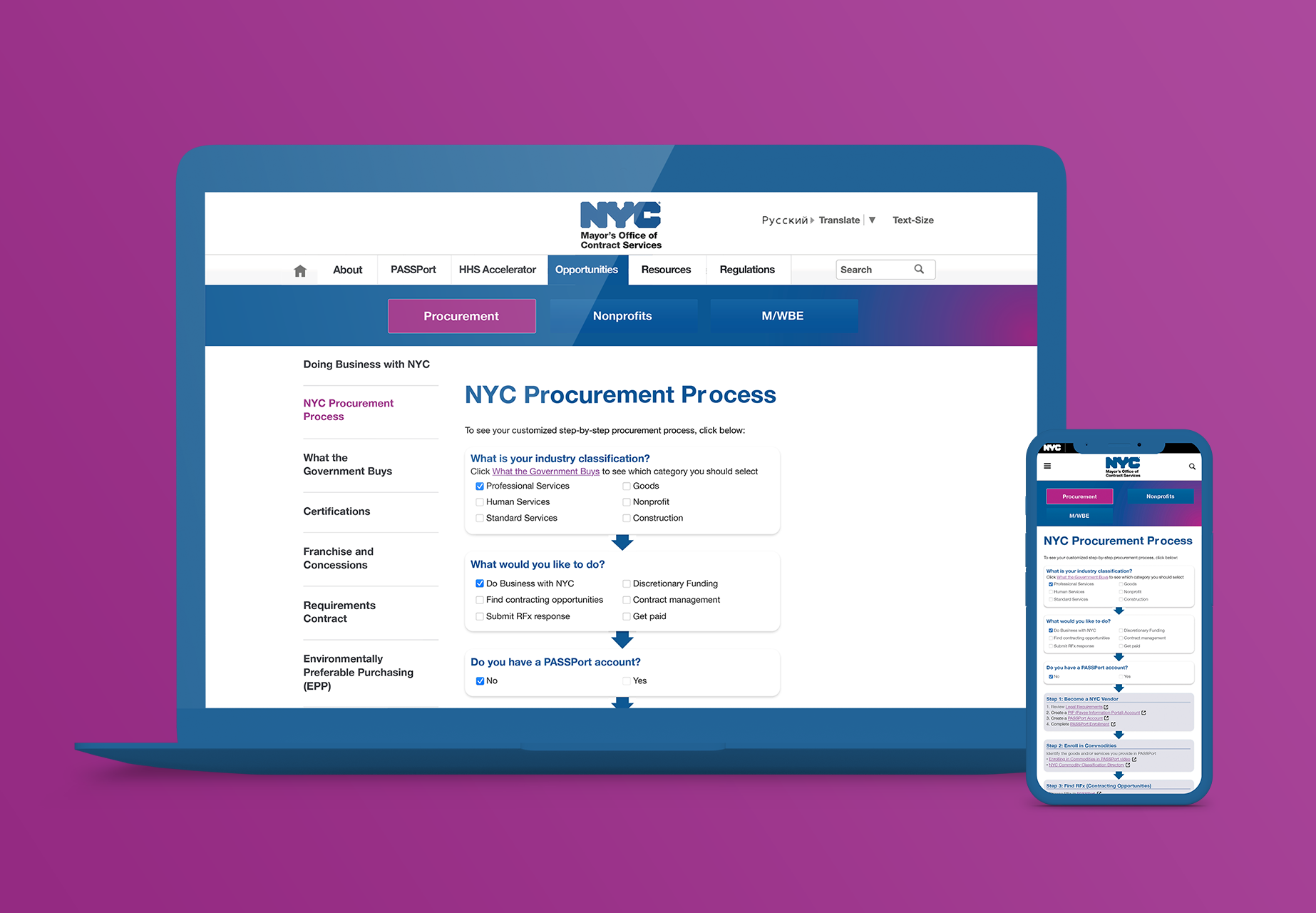
Wireframe & prototypes for usability-testing
Wireframes and prototypes were created for user testing to ensure an intuitive understanding of the site‘s structure and reveal vulnerabilities in the user interface and interactions. User tests were performed by giving relevant tasks, such as asking users "Where would you click if you wanted to find business opportunities?" The sitemap and wireframes were adjusted based on user feedback, questions and suggestions.
Design validation
Usability testing sessions with primary users confirmed the new designs solved their problems. A script including usage scenarios was created asking users to complete the most common tasks. These sessions confirmed the website redesign enabled users to easily and quickly find the information they need and garnered much positive feedback.
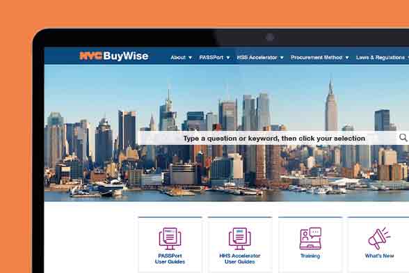
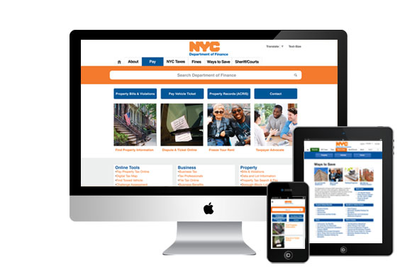
Solutions for the redesign
• Making the homepages the center of information and wayfinding — the new homepage enables one-click navigation to the most often-used pages
• Establish visual hierarchy, content placement, naming and design: reorganize information and update semantics (naming) to provide an intuitive user experience
• Streamline navigation: to reflect user behavior and eliminate redundant pages
• New search bar: use predictive search intelligence to facilitate relevant answers
• Condense content: reduce the amount of text, as well as incorporate bullets, step-by-step visuals and screenshots so users can quickly and easily comprehend information
• Recommended new pages to improve user experience
Related Work